An e-commerse redesign that delivered +13.3% session-to-sale & +36.4% active customer growth.

MANIKO Website Redesign

5 min read

TL;DR

The conversion data told one story.
Users told a sharper one.

The problem

MANIKO's shopping experience was leaking conversions. The data showed clear drop-off points, and the dated visual design was creating distrust, especially with first-time visitors who'd never seen the product in person.

My role

As a solo designer in a small in-house team, I led the UX research, problem validation, information architecture, prototyping, user testing and final hi-fi designs.

The outcome

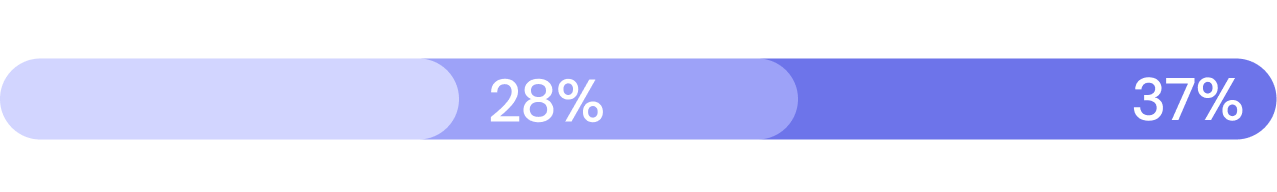
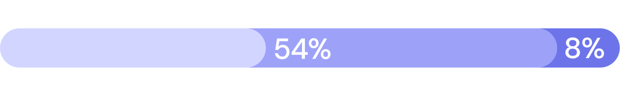
13.3% increase in session-to-sale. 36.4% growth in active customers. 23.8% uplift in Starter Set conversion. 14% improvement in web accessibility. All within 2 months of launch.

Project context

What

E-commerce Website Redesign

Client

MANIKO Nails GmbH

Timeline

5 months

Team

Sole designer

My Role

ux research
problem validation
information architecture
user testing
hi-fi designs

Overview

MANIKO is a D2C beauty brand selling nail polish wraps online. I was tasked with improving and modernizing the website shopping experience. The conversion data was showing clear friction: drop-offs during browsing, confusion around the Starter Set (their highest-margin product) and a checkout flow that wasn't optimized for how people actually buy. The redesign needed to build trust with first-time visitors, simplify the path to purchase and do it all on Shopify.

The Design Challenge

The numbers said something was broken. The research showed us where - and why.

First-time trust gap

Most visitors were arriving through social ads and had never heard of the brand. The existing site didn't do enough to prove the product was real, the brand was legitimate or the reviews were trustworthy.

A flagship product nobody understood

The Starter Set was MANIKO's highest-margin product and most popular with beginners, but the way it was presented caused more confusion and customer care tickets than any other item on the site.

A checkout that fought the user

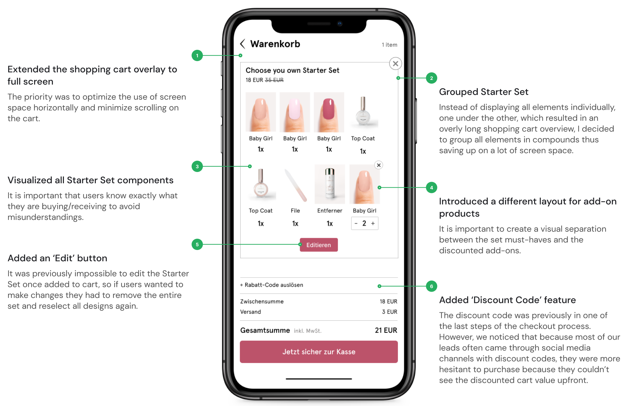
Products displayed individually in the cart made it impossible to understand what you were buying. 38% of orders had 4+ items, resulting in endless scrolling and a bad overview.

The process & design decisions

Survey first. Then talk to the people who answer the phones.

The research combined quantitative data (90+ survey respondents) with qualitative insights from usability tests, internal interviews and conversion funnel analysis.

The Planetary Design Pack (Digital) infographic with five numbered sections: 01 Definition to understand environmental context, 02 Exploration for planet-centric solutions, 03 Solution to test potential outcomes, 04 Prototype for planetary goals and accessibility, 05 Test & Action Plan to assess product/market fit with customers.
Design process flowchart with stages: Research, Ideation, Concept Development, and Test & Measure, each with related activities above and below.Design process flowchart with stages: Research, Ideation, Concept Development, and Test & Measure, each with related activities above and below.Design process flowchart with stages: Research, Ideation, Concept Development, and Test & Measure, each with related activities above and below.Design process flowchart with stages: Research, Ideation, Concept Development, and Test & Measure, each with related activities above and below.Design process flowchart with stages: Research, Ideation, Concept Development, and Test & Measure, each with related activities above and below.Design process flowchart with stages: Research, Ideation, Concept Development, and Test & Measure, each with related activities above and below.

Start with what the users say

The 5-phase methodology builds on Lean and Jake Knapp's Design Sprint, which are frameworks teams already trust. The innovation isn't the structure. It's what happens inside each phase when you add the environmental layer.

Then talk to the people who hear the complaints

Internal interviews with Customer Care and Business Development surfaced the patterns that surveys miss: what people call about, what questions repeat, what makes them return products. Those conversations shaped the priorities more than the numbers alone.

Validate with real users, not assumptions

I ran 5 live usability tests to watch people try to shop. The quotes were blunt: "The checkout is particularly bad," "Most of the pictures look fake," "I don't trust the brand enough to purchase yet." That directness made the problems impossible to deprioritize.

Prioritize by pain, not by page

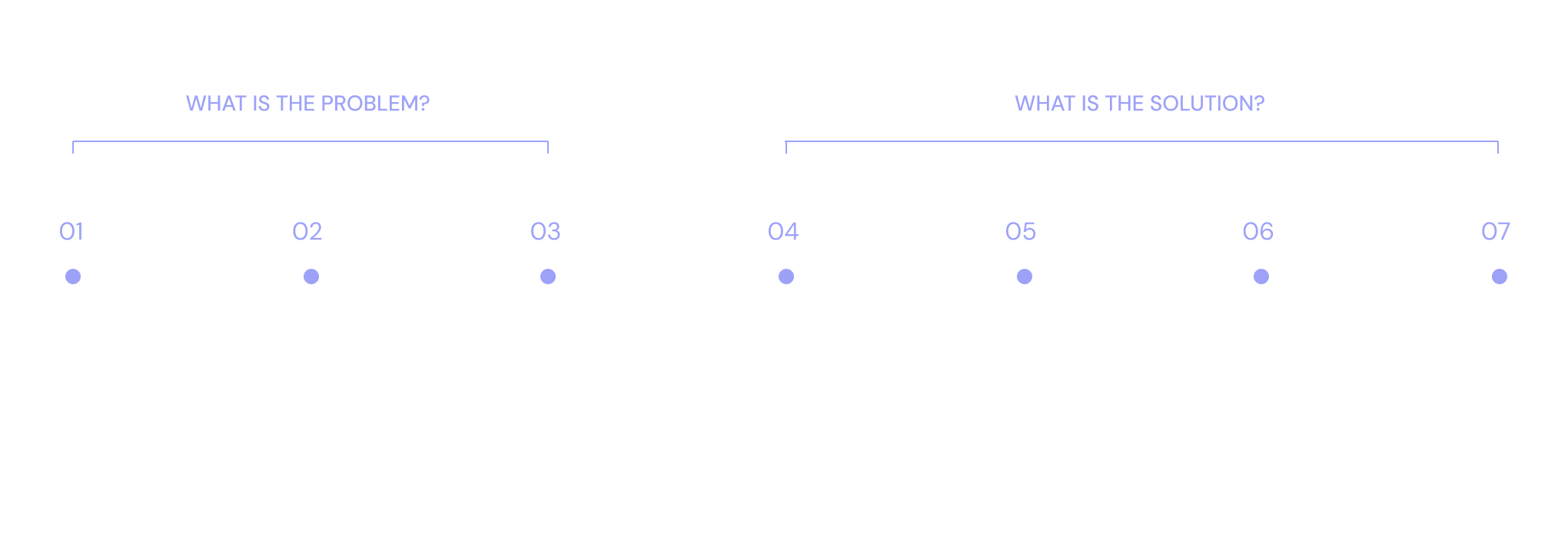
The three highest-impact areas weren't defined by site structure. They were defined by where trust broke down: the homepage (first impression), the Starter Set (highest confusion, highest margin), and the shopping cart (highest drop-off).

Design process flowchart with stages: Research, Ideation, Concept Development, and Test & Measure, each with related activities above and below.Design process flowchart with stages: Research, Ideation, Concept Development, and Test & Measure, each with related activities above and below.Design process flowchart with stages: Research, Ideation, Concept Development, and Test & Measure, each with related activities above and below.Design process flowchart with stages: Research, Ideation, Concept Development, and Test & Measure, each with related activities above and below.Design process flowchart with stages: Research, Ideation, Concept Development, and Test & Measure, each with related activities above and below.Design process flowchart with stages: Research, Ideation, Concept Development, and Test & Measure, each with related activities above and below.

finding solutions

Based on the user research I identified the following key issues and outlined solutions.

The Planetary Design Pack (Digital) infographic with five numbered sections: 01 Definition to understand environmental context, 02 Exploration for planet-centric solutions, 03 Solution to test potential outcomes, 04 Prototype for planetary goals and accessibility, 05 Test & Action Plan to assess product/market fit with customers.
THE SOLUTION

Three pages. Each one solving a different trust problem.

01 Homepage

Building trust from the first scroll

The homepage needed to prove 3 things in the first 5 seconds: (01) the product is real, (02) other people use it and (03) the brand is credible.

I introduced a bold header video showing the product in use, added a "known from" press section, displayed real customer reviews prominently, and made the main USPs visible without scrolling.

The Planetary Design Pack (Digital) infographic with five numbered sections: 01 Definition to understand environmental context, 02 Exploration for planet-centric solutions, 03 Solution to test potential outcomes, 04 Prototype for planetary goals and accessibility, 05 Test & Action Plan to assess product/market fit with customers.

02 Starter Set

Making the best-seller beginner-friendly

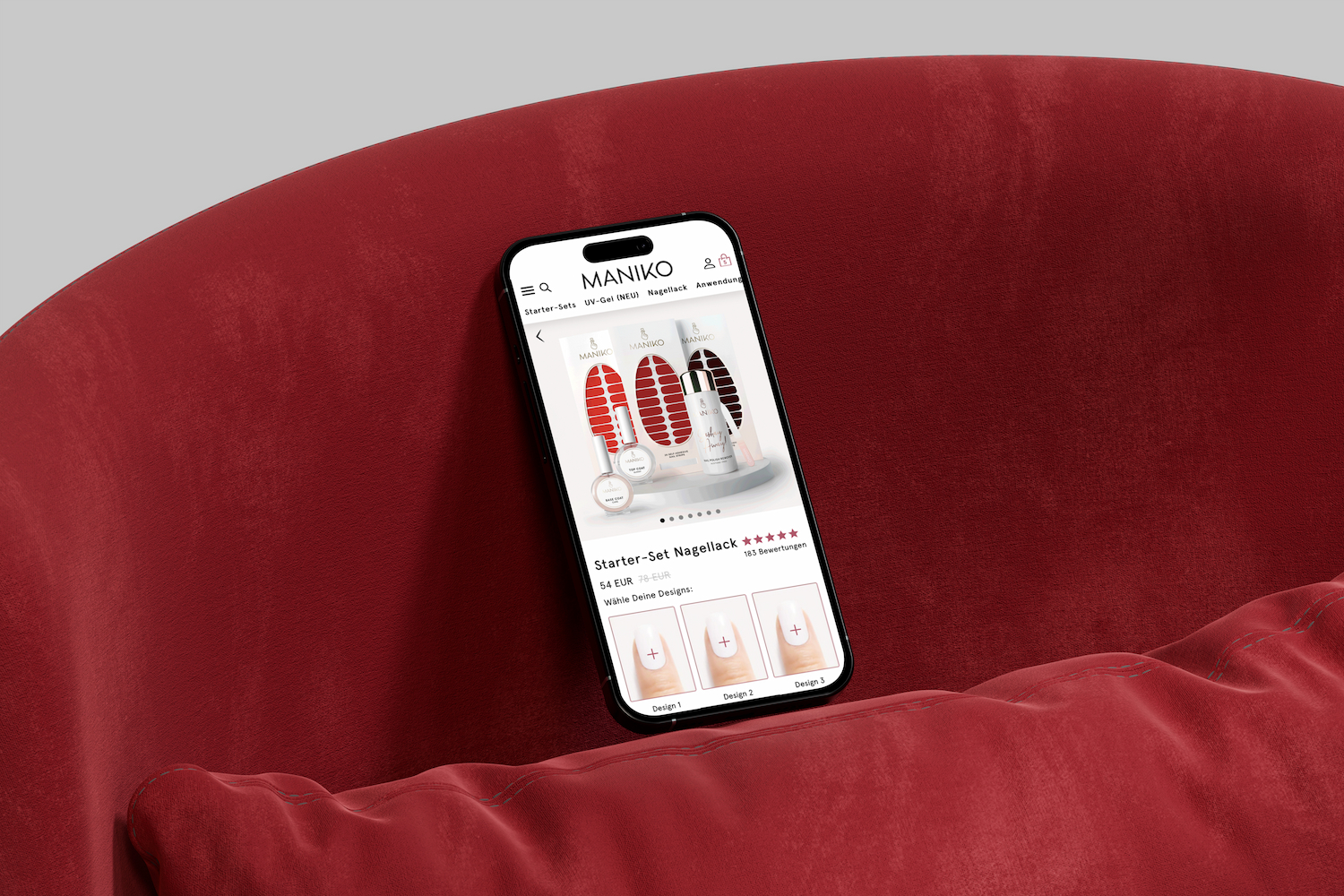
The Starter Set was generating the most customer care tickets. First-time buyers didn't understand what was included, couldn't see the accessories, and found the customization confusing. I redesigned the set page with explicit component visualization, built a design selector with search and filters and rewrote the copy to speak to someone who's never used the product.

The Planetary Design Pack (Digital) infographic with five numbered sections: 01 Definition to understand environmental context, 02 Exploration for planet-centric solutions, 03 Solution to test potential outcomes, 04 Prototype for planetary goals and accessibility, 05 Test & Action Plan to assess product/market fit with customers.

03 Shopping Cart

Ending the scroll

The old cart displayed every item individually, so a 4-product order meant an unusably long page. I extended the cart overlay to full screen, grouped Starter Set components into a single compound, added an edit button (previously you had to remove and re-add), introduced visual separation between the set and add-ons, and moved the discount code field upfront since most leads came through social campaigns with promo codes.

The Planetary Design Pack (Digital) infographic with five numbered sections: 01 Definition to understand environmental context, 02 Exploration for planet-centric solutions, 03 Solution to test potential outcomes, 04 Prototype for planetary goals and accessibility, 05 Test & Action Plan to assess product/market fit with customers.
Impact

Within 2 months of launch.

13.3%

Increase in Session-to-Sale

*according to internal CR data

36.4%

Increase in Active Customers

*according to internal CR data

23.8%

Increase in Starter Set conversion rate

*according to internal CR data

14%

Increase in Overall Web Accessibility

*according to Shopify Shop Score (Google Lighthouse)

WHAT THE TEAM SAID

The people who use the site every day noticed the difference first

“Thanks to the improved website, our customers can find all the important information quickly, so Customer Care receives fewer general inquiries. The website and especially the shopping cart are clearer, so there is less irritation from the customers’ side. We have also noticed fewer order returns.”

Christiane Volmari

Head of Customer Service

“With the implementation of new features, we can now much more easily distribute more content on the site, which internally is proving to be very time and resource saving. As a result, we can now do more launches with better content in the same period of time, which in turn attracts more customers and drives sales.”

Stefanie Batzel

Project Manager

If you're still reading, we'd probably work well together.